For the best viewing experience, responsive design is an excellent approach for web and theme designing. If you are planning for your new web design or WordPress theme than the following list of responsive CSS Frameworks will be worth considering.
Let have a look and you may be interested in our other articles on Photography WordPress Themes, Responsive Slider Plugins for WordPress, Design Inspiration and Sports WordPress Themes.
1. Skeleton

Skeleton is a small collection of CSS files that can help you rapidly develop sites that look beautiful at any size, be it a 17″ laptop screen or an iPhone.
2. Less Framework 4

Less Framework is a CSS grid system for designing adaptive websites. It contains 4 layouts and 3 sets of typography presets, all based on a single grid.
3. The Semantic Grid

Set column and gutter widths, choose the number of columns, and switch between pixels and percentages.
4. Gumby

Gumby Framework includes multiple types of grids with different column variations which enables you to be flexible throughout an entire project’s lifecycle. From concept to deployment, Gumby Framework follows your lead.
5. Foundation

Foundation is the most advanced front-end framework in the world. While the framework works all the way back to IE8, we’re taking advantage of new, awesome Web technology to help you build better and faster.
6. Responsive Grid System
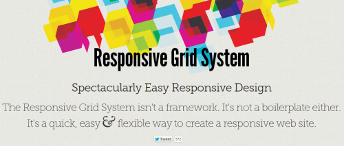
The Responsive Grid System isn’t a framework. It’s not a boilerplate either. It’s a quick, easy & flexible way to create a responsive web site.
7. 1140 CSS Grid

The 1140 grid fits perfectly into a 1280 monitor. On smaller monitors it becomes fluid and adapts to the width of the browser.
8. Frameless

Adapt column by column, not pixel by pixel.
9. Golden Grid System

Golden Grid System (GGS) splits the screen into 18 even columns. The leftmost and rightmost columns are used as the outer margins of the grid, which leaves 16 columns for use in design.
10. Twitter Bootstrap

Sleek, intuitive, and powerful front-end framework for faster and easier web development.
11. Gridless

Gridless is an optionated HTML5 and CSS3 boilerplate for making mobile first responsive, cross-browser websites with beautiful typography.
12. Amazium

So what is Amazium I hear you ask, well you may have been hearing the term “Responsive Web Design” being thrown around the past few months, which simply means a website that can adjust to your screen size without having to make a separate website!
13. 320 and Up

320 and Up is a lightweight, easy to use and content first responsive web design boilerplate.
14. Fliud Baseline Grid

The Fluid Baseline Grid System is an HTML5 & CSS3 development kit that provides a solid foundation to quickly design websites with ease.
15. SimpleGrid

SG is prepared for 4 distinct ranges of screen size: screens < 720px, screens > 720px, screens > than 985px, and screens > than 1235px. So people visiting your site will receive a layout that’s tuned to the size of their browser window. Say goodbye to horizontal scrollbars.